2012 Senior Art Thesis
Perry Ryan
ARTIST STATEMENT
I have always been interested in how powerful the media is, but have struggled with a love hate relationship of subjecting myself to magazines and unrealistic images of beauty, to despising the premise behind manipulating both people and images in order to get them to be active consumers.
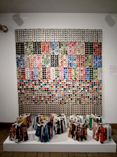
After accumulating magazines and spending time with them, I was struck by the repetitive and limited palette of colors magazines use to attract viewers to ads. As someone who is interested in marketing and human behavior I began to realize trends in the use of colors. For example, green was used “environmentally friendly” or “organic” products, red was used to sell cars, weight loss products and food, beige was used too sell makeup, blue was related to insurance and vacation ads, black was used to sell jewelry and perfume, and pink was mostly used in clothing ads and for caption boxes.
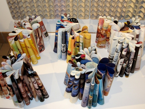
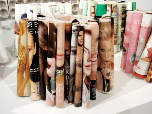
My wall work shows the viewer a different way to look at the advertisements we see. This piece allowed me to convert lifeless magazine paper into a work with mass and volume. The transformation of the magazine page into a seed shape suggests the beginning of something. Each seed has a definite space it is supposed to fit into. The process of the floor pieces led to a more organic form focusing on shape and silhouettes.


No comments yet.
Comment Guidelines
Please log in to post a comment